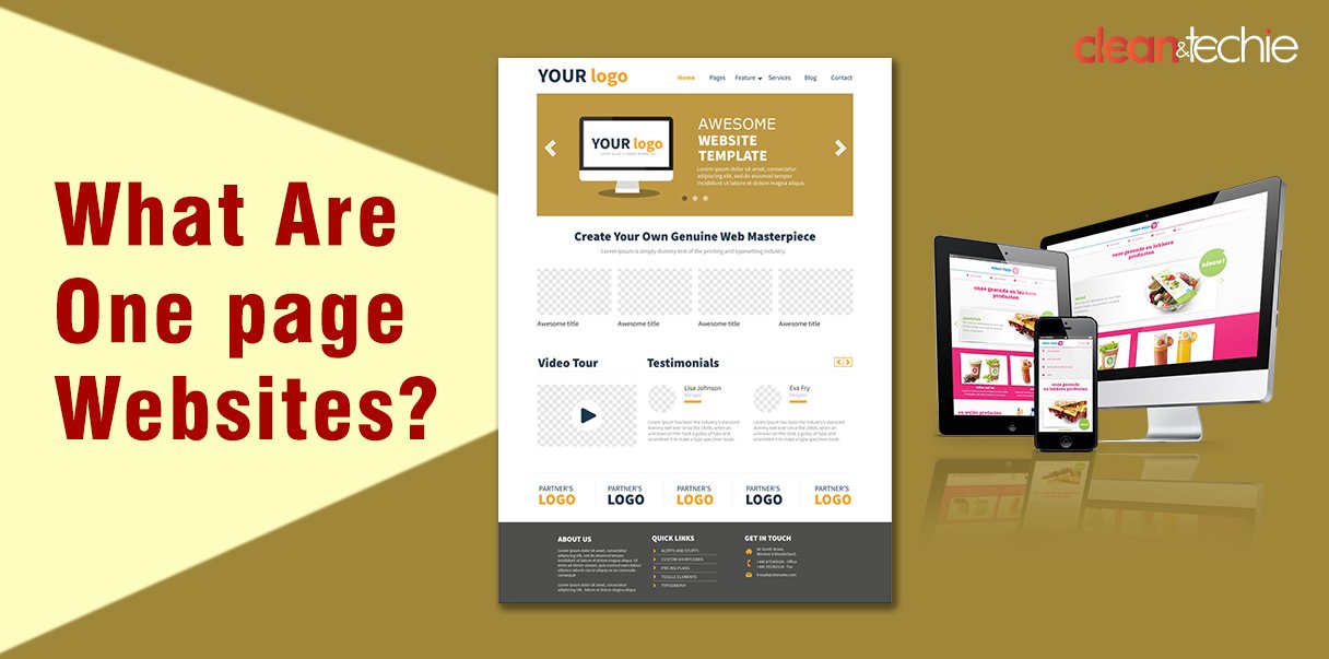
These websites allow users to scroll through all the content on one page smoothly. You don’t need to look around for different pages or menu options to be clicked to find what you’re looking for. Additionally, one-page websites organize their content into clear sections for easy understanding.
In other words, a single-page website is designed to give people specific and required information so they can decide and take required action online.
One-page websites are also known as “one-page scrolling” or “parallax” websites.
What is the objective of One page websites?
A single-page website is ideal for those seeking a straightforward online presence centered around visual content, as images have a powerful storytelling ability. This format is particularly suitable for showcasing portfolios, promoting events, or displaying restaurant menus.
Such websites allow users to seamlessly scroll through all the content on a single page, eliminating the need to navigate multiple pages for various types of information. Furthermore, they typically feature clear and concise sectional content, making it easy for users to understand and navigate.
It’s often used for landing pages, showing products, portfolios, or events. These sites focus on the content and grab users’ attention by keeping things simple and clear.
Structure of a One Page Website:
Let us talk about the fascinating aspect of single-page websites- Its structure:
Imagine a website with one single page that is neatly organized with all the required information. No clicking through multiple pages like “About Us” or “Contact Us.” Everything you need is right there, loaded up from the start.
When you navigate through a single-page website, you’ll notice something special. Instead of jumping between pages, you smoothly scroll down, taking in the content as it unfolds. It’s a truly immersive experience, with each section seamlessly blending into the next.
This unique design approach serves a specific purpose: to provide users with exactly what they need to do to design their website. It may be a landing page, a product showcase, a portfolio, or an event page, single-page websites cut through the clutter and focus squarely on the content that matters most.
Now, you might be wondering: why should you consider a single page website for your project? Well, imagine being able to convey your message without the distraction of menus or the need to click through multiple pages. Single-page websites offer native responsiveness, keeping your content accessible and engaging across devices. Plus, they often come with lower design costs, making them an attractive option for many businesses.
But, like all things, single-page websites have their drawbacks. It’s essential to weigh the pros and cons carefully before diving in.
So, as you think about your website’s architecture, consider the possibility of a single-page design. It might just be the perfect fit for your needs.
Here are some differences between the two:
| One Page Website | Multi-Page Website |
| Single-page websites are designed with a single scrollable page containing all the necessary content. | Multi-page websites are a type of web design comprising interconnected pages, each dedicated to distinct subjects, products, or services. |
| Users can easily navigate single-page websites with precision and concentration. By eliminating the need for users to navigate multiple pages, they can swiftly find the information they need. | Multi-page websites excel at providing comprehensive information about a company. Each page can be dedicated to a specific topic, enabling thorough treatment and detailed descriptions. |
| People like Single-page websites to view on their phones and tablets. These websites are designed to work well on mobile devices. When you create a single-page website, you can be sure it’ll look good and function properly on different gadgets. | Multi-page websites allow you to create separate pages for different purposes, like promoting specific campaigns, showcasing services, or displaying products. By optimizing these pages for targeted marketing efforts, you can boost your conversion rates. |
| Tracking what people do on a single-page website is harder than a regular website. | It’s easier to see what people do on a website with many pages. |
| Single-page websites may struggle to provide extensive information about a company, product, or service. Due to the limited space available on a single page, there’s a restriction on the amount of content that can be included. | Websites with multiple pages are good at giving lots of information about a company, its past, products, and services. Each page can focus on one topic, so you can talk about it in detail and give full descriptions. |
Conclusion:
In contrast to conventional websites, a single-page website unfolds its content through vertical scrolling, with users navigating through various sections seamlessly. The traditional menu buttons are absent here, require content to be strategically organized to maintain user engagement. Often referred to as long-form websites due to their extended content, these one-page sites present condensed versions of information typically spread across multiple pages on traditional websites.
The single-page layout is widely favored as it provides designers with greater flexibility to unleash their creativity, thereby crafting a profoundly engaging user journey. Nevertheless, it may not be the optimal solution for all scenarios. Prior to committing to the development of a one-page website, it is prudent to carefully weigh the advantages and disadvantages associated with this approach.
Read Also: Impact of Technology on the Food Industry


